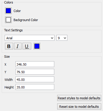
Use the Styles tab to format a selected model item or items.
This image shows the available style properties for a stock. The available properties vary depending on what item you've selected. If you select multiple items, only properties they share will appear.
Reset styles to model defaults will change the style of the object(s) to the model default style. This means that if you change the model default, that change will cascade to the currently selected objects. For example, if you change the font size and color on the model properties panel, it will change the font size and color for the selected objects. Not all elements of styles can be accessed as the model default, and clicking on this may do nothing to those elements of the styles.
Reset size to model defaults will set the size of the object(s) back to model defaults. This applies to stocks, and converters.
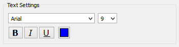
Use the colors section to set the text and background colors for the selected item. For some items, you can also set borders and lines.
For either choice, a Select Color window will appear:
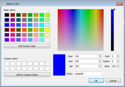
Click a preset color, or change the numeric values to edit the color.
Locked Notes
If you want to edit the properties for a locked object, you'll need to double-click on the object.
Using Select All from the Edit menu will select locked objects. This means that you can copy the entire contents of a page and paste them into another page. After pasting, the object will remain locked.
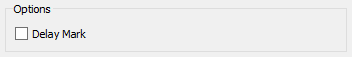
Check this to put a delay mark on a connector.
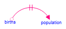
Delay marks are used to denote time delays in causal loop diagrams, where the connector typically points to what would be a stock in a complete model.
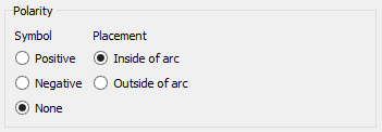
Use this to place a polarity mark at the arrowhead of the connector. Positive will display a + or an s, depending on your settings in the model styles tab. Negative will display a - or an o, depending on your settings. You can place the arrow on different sides of the arrowhead by choosing between "Inside of arc" and "Outside of arc."
The table has a number of style options that are unique to it.
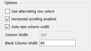
Use alternating row colors, if checked, will cause the table to display adjacent rows in different background colors. This can make it easier to read across a row.
Horizontal scrolling enabled, if checked, sizes columns either based on their label width or a specified fixed width, and provides a scroll bar to allow you to change what's visible. If this isn't checked, and the columns can all be fit into the available space, it will make the columns wider so as to use up the available space. If the columns don't all fit, this option has no effect.
Auto-size column width, if checked, sets the column width so that the entire contents of all cells is visible. Each column will be a different width. If this isn't checked, every column will be the same width, the width specified in Column Width.
Column Width, can only be specified if Auto-size column width isn't checked. It specifies the width, in pixels, of each column that isn't blank.
Blank Column Width specifies the width, in pixels, of blank columns. Blank columns have no content so this is the only determinant of their width. Blank columns can only be added when time is vertical.