 tool.
tool. , you can also change the appearance of the button, the color of the button and the annotation box, and the text styles on the button and annotation box.
Use annotation buttons to add annotations to your Interface. You can add text, and use it to describe changes to the model, explain model behavior, or add information that doesn't make sense to add to the model itself. You can also add images or videos.
The annotation button is only available in Interface mode.
tool., you can also change the appearance of the button, the color of the button and the annotation box, and the text styles on the button and annotation box.
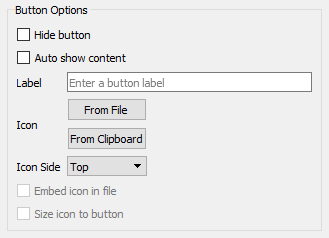
You can show the button under Button Options in the Properties panel, and then modify its appearance on the interface.
By default, Hide button will be selected. While editing, the button will appear as a shaded patch. In presentation mode, the button won't be visible, and the annotation box will pop up automatically when the user moves to the page the button is on. If you want the button to be visible, deselect Hide button. You can then change the size, shape, color, etc. of the button from the Properties panel, and the button will be visible in presentation mode.
Auto show content will also be selected by default. This is so that the annotation will appear without user input, which is necessary if the user can't see a button. Even if your button is visible, you can leave this option selected, and the annotation will still appear immediately when the user reaches the button's page. If you deselect Auto show content, the annotation will pop up when the user clicks on the button.
You can add words to your button, if you want to. Use the label space to type out what you want written on your button. Make sure to change the size and shape of your button so that the label is easy to read, or go to the Style Settings tab of the Properties panel and change the Text Settings.
You can control the appearance of the button just as you would a button object. See the Button (Interface) for more details on this.
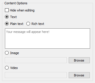
If you'd like to hide the annotation box while you edit your button, select Hide when editing. Make sure you've selected the button and not the annotation box when doing this; both will give you the same Properties panel, but the option will be grayed out if the annotation box is selected. This option is helpful for editing if you want your annotation to appear directly over your button.
You can also use the content options to use Rich text instead of Plain text, or even to forgo text altogether and insert an image or video instead. If you want an image or video, select which one you want, click Browse, and find the image or video in your library.