Open Professional
If you have Stella Professional start it. If you have Stella Architect, and are in the interface window, go to the model window (select Open Model window from the Window menu, or click on ![]() in the Build toolbar).
in the Build toolbar).
You should see an empty model:
Set the Time Range
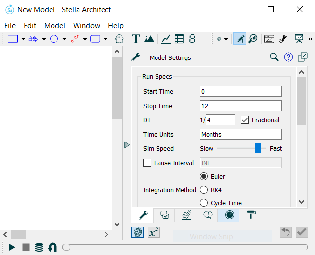
In the panel to the right, change the Stop Time to 100. Make sure that Start Time is 0 and DT is 1/4 with Fractional checked (normally these will already be this way).
Plan out the Model
We want to model population growth in the face of a limited carrying capacity. While planning out a model normally takes significant time and thought, in this case we'll jump to a very simple structure: essentially just population, births, deaths, and an effect from crowding. As we progress, we'll fill in a few of the details around this formulation to make the complete model.
Put down the Stock
Our main, and only, stock is population, and putting down stocks is almost always the best way to get started building models.
Click on the Stock tool (![]() or
or ![]() ) on the Build toolbar at the top, then click in the upper middle part of the white area below.
) on the Build toolbar at the top, then click in the upper middle part of the white area below.
To the right you should see this panel:
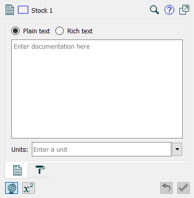
Type in "Population" where the stock uses the default name (Stock 1).
Click on ![]() at the bottom of the panel, and you'll see the equation panel:
at the bottom of the panel, and you'll see the equation panel:
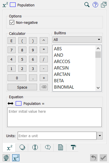
In the equation box, type in 25, and in the Units box, type in Critters (or Frogs, or Rabbits, or any other species you'd like).
Simulate the Model
Click on the Run button ![]() in the Run toolbar at the bottom of the program. After you do that, you'll see that Population has a small graph inside of it:
in the Run toolbar at the bottom of the program. After you do that, you'll see that Population has a small graph inside of it:

With nothing to change Population, it simply remains constant at 25.
Add Births
Click on the Flow tool (![]() or
or ![]() ), then press the mouse button down to the left of Population, drag the mouse until it's over the rectangle for population, and release the mouse button. Type in "births". Your diagram should look like this:
), then press the mouse button down to the left of Population, drag the mouse until it's over the rectangle for population, and release the mouse button. Type in "births". Your diagram should look like this:
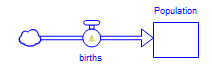
The small caution sign indicates that births hasn't yet been defined. To define it, we first need to add additional structure.
Click on the Converter tool ![]() , then click above births, and type in "birth rate". In the equation panel at the right, enter 0.05 for the equation and Per Month for units.
, then click above births, and type in "birth rate". In the equation panel at the right, enter 0.05 for the equation and Per Month for units.
Click on the Connector tool ![]() , then press the mouse button down on the circle above birth rate, drag the mouse to the circle above births, and let go.
, then press the mouse button down on the circle above birth rate, drag the mouse to the circle above births, and let go.
Click on the Connector tool ![]() again, then press the mouse button down on the rectangle below Population, drag the mouse to the circle above births, and let go.
again, then press the mouse button down on the rectangle below Population, drag the mouse to the circle above births, and let go.
Select the small handles at the beginning of each of the flows you've just created in order to change the shape of the connectors. You should end up with a diagram that looks like this:
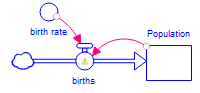
You can also click on any of the names and reposition them relative to their corresponding shape (circle or rectangle) by dragging them, if you want to create a more pleasing diagram.
Click on births, and, in the equation panel at the right, click on Population in the list toward the top, then the * button in the Operators list, then birth rate in the same list Population is in. Your equation should look like this:
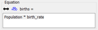
You can also simply type in the above (as you do so, an autocomplete will appear).
Note that units are already filled in - this is done automatically for flows based on the stock they're connected to.
Simulate again
Click on the Run button ![]() in the Run toolbar at the bottom of the program. This time we get more interesting behavior:
in the Run toolbar at the bottom of the program. This time we get more interesting behavior:
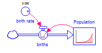
By clicking on the circle above birth rate, you can spin the dial to see what happens as the birth rate changes.
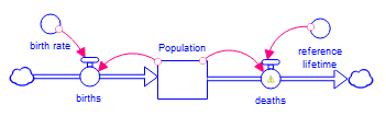
Add Deaths
Click on the Flow tool (![]() or
or ![]() ), then press the mouse button down on the rectangle below Population, drag the mouse to the right, and release the mouse button. Type in "deaths".
), then press the mouse button down on the rectangle below Population, drag the mouse to the right, and release the mouse button. Type in "deaths".
Click on the Converter tool ![]() , then click above deaths, and type in "reference", press the enter key, and type in "lifetime". In the equation panel at the right, enter 60 for the equation and Months for units.
, then click above deaths, and type in "reference", press the enter key, and type in "lifetime". In the equation panel at the right, enter 60 for the equation and Months for units.
Click on the Connector tool ![]() , then press the mouse button down on the circle above reference lifetime, drag the mouse to the circle above deaths, and let go.
, then press the mouse button down on the circle above reference lifetime, drag the mouse to the circle above deaths, and let go.
Click on the Connector tool ![]() again, then press the mouse button down on the rectangle below Population, drag the mouse to the circle above deaths, and let go.
again, then press the mouse button down on the rectangle below Population, drag the mouse to the circle above deaths, and let go.
Adjust the connectors by dragging the small handles at their beginnings. You should end up with a diagram that looks like this:
You can also click on any of the names and reposition them relative to their corresponding shape (circle or rectangle) by dragging them, if you want to create a more pleasing diagram.
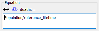
Click on deaths, and, in the equation panel at the right, click on Population in the list toward the top, then the / button in the Operators list, then reference lifetime in the same list Population is in. Your equation should look like this:
You can also simply type in the above.
Again, you can experiment with the model by running it and changing values for both birth rate and reference lifetime.
Add Carrying Capacity
Click on the Converter tool ![]() , then click just to the right of birth rate, type "carrying", press enter, and type "capacity". In the equation panel at the right, enter 200 for the equation and Critters (or the species you previously chose) for units.
, then click just to the right of birth rate, type "carrying", press enter, and type "capacity". In the equation panel at the right, enter 200 for the equation and Critters (or the species you previously chose) for units.
Click on the Converter tool ![]() , then click between carrying capacity and reference lifetime, and type "effect of crowding on deaths", pressing the enter key instead of the space bar to break it up into 3 lines (effect of[enter]crowding on[enter]deaths).
, then click between carrying capacity and reference lifetime, and type "effect of crowding on deaths", pressing the enter key instead of the space bar to break it up into 3 lines (effect of[enter]crowding on[enter]deaths).
Click on the Connector tool ![]() , then press the mouse button down on the circle above carrying capacity, drag the mouse to the circle above effect of crowding on deaths, and let go.
, then press the mouse button down on the circle above carrying capacity, drag the mouse to the circle above effect of crowding on deaths, and let go.
Click on the Connector tool ![]() again, then press the mouse button down on the rectangle below Population, drag the mouse to the circle above effect of crowding on deaths, and let go.
again, then press the mouse button down on the rectangle below Population, drag the mouse to the circle above effect of crowding on deaths, and let go.
Click on the Connector tool ![]() yet again, then press the mouse button down on the circle above effect of crowding on deaths, drag the mouse to the circle above deaths, and let go.
yet again, then press the mouse button down on the circle above effect of crowding on deaths, drag the mouse to the circle above deaths, and let go.
Adjust the connectors by dragging the small handles at their beginnings. You should end up with a diagram that looks like this:
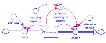
Click on deaths, then click on the end of the existing equation, click on * in the operator list, and click on error of crowding on deaths in the Required Inputs list. Your equation should be:
Population/reference_lifetime*effect_of_crowding_on_deaths
Click on effect of crowding on deaths and enter the equation:
Population/carrying_capacity
and set the units to dimensionless.
Click on the Graphical Function ![]() tab at the bottom of the Equation panel, then check the Graphical checkbox. Enter 10 at the top left corner of the graph, and then drag the mouse across the graph to draw. You want to end up with something like this:
tab at the bottom of the Equation panel, then check the Graphical checkbox. Enter 10 at the top left corner of the graph, and then drag the mouse across the graph to draw. You want to end up with something like this:
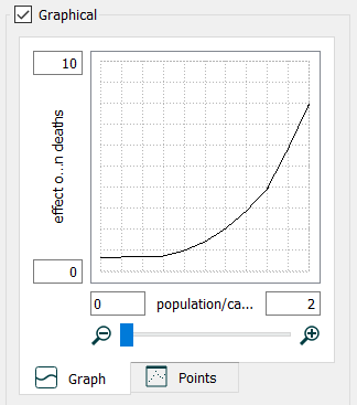
The exact values are not important, but it should follow the above shape and roughly go through the 1,1 point (if you move the mouse over the graph without dragging, the values of the different points will be displayed).
What the graph above defines is the relationship between crowding (population/carrying_capacity) and the effect it has on deaths. As crowding increases, deaths increase (lifetimes go down) at an ever increasing rate.
Add a graph
Click on the Graph ![]() tool in the Build toolbar, and click on an open place in the diagram.
tool in the Build toolbar, and click on an open place in the diagram.
Move and size the graph that's created to your liking.
Holding down the Ctrl key (the ⌘ on Macintosh), drag population onto the graph.
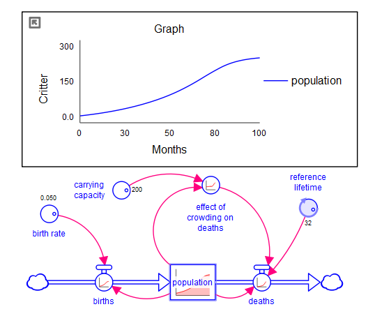
You'll see a graph of population, based on the last run made (before carrying capacity was added).
Simulate again
Click on the Run button ![]() in the Run toolbar, at the bottom of the program. This time, the graph and the diagram will fill in. You should see something like this:
in the Run toolbar, at the bottom of the program. This time, the graph and the diagram will fill in. You should see something like this: