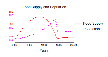
Use graphs to plot data generated by model simulations. The software supports three basic types of graphs: time series plots (X, Y, Z over time, as shown in the example below), scatter plots (X vs. Y), and bar graphs.

Regardless of the type of graph, you can choose to plot the output from a single simulation run, or to display a comparative plot, where the results from multiple simulation runs appear on the same graph.
You can also create a sketchable graph, which allows you or a model user to "sketch out" the expected performance for a single variable, for comparison against the variable's actual performance over a simulation run. When you create a sketchable graph, the graph displays output for the variable along with the user-created sketch of the graph. For more information about defining and using sketchable graphs, see Sketchables.
Define a graph by selecting the type of graph you want to create, and the variables whose values you want to include in the graph. You can also select options to customize the display of the graph, including scaling options, whether the graph displays a grid in the background, and whether the graph draws curves with thick or thin lines.
Once you've placed a graph on the model, the software allows you to add pages to the graph that you can scroll through. Each page will contain a different graph. The collection of pages is called a graph pad.
Click the diagram to place the graph.
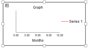
An empty graph appears:

To define one or more graphs, double-click on the newly placed graph and the Graph Properties Panel will open.
Use the options in the Properties panel to define one or more graphs on the newly created graph pad.
Select the type of graph you want to create: Time Series, Scatter, or Bar.
Select the variables that you want to graph.
Tip: You can also add variables to a graph by Ctrl-dragging them (⌘-dragging them on Mac) from model diagram, or by dragging them from the Find window onto the graph.
If you've selected an arrayed variable, the Choose Subscript dialog box opens so that you can select which elements in the array to graph. To graph all elements in a dimension, select the * in the list of elements; otherwise, select the specific element to graph for each dimension.
Note: There may be many elements in a dimension. A graph containing more than 5 curves is usually hard read.
Set the scales for the variables you've chosen. Leave them blank to use the scales set in the variable properties. The graph will use run values if the scales set in the variable properties are also blank.
You can add new pages to the graph pad as described in the Graph Properties Panel. As you add and modify pages, the results will be displayed on the model diagram.
Note: If the model has already been run (and the database file that contains the model data exists in the proper location on your computer), the graph will display the curves for data generated in the last run.
Once one or more simulations have run, the graph displays a curve for the values of each included variable for that run. Although you can estimate variable values at-a-glance by looking at the graph, you can also see exact values for all variables at any point on the graph.
Click inside the graph, then drag across the graph.
The selected time appears below the graph and the values for each variable at that time are shown in the legend.
Numbers in graphs get their precision from the variables' precision. To change this, open the Scales and Ranges tab of the Properties panel for the variable you want to change.
You can also override these settings for a specific graph.
Note: The selections you make on the graph for precision, units, and scaling affect the display of the variable in the graph only.
In the graph, right-click, then select Format from the menu that appears. Then select the name of the variable you want to change, or select time.
The Format Variable dialog box will open.
Variable formatting affects the scales and the values displayed as you drag across the graph.