Place a button on the interface in order to allow the user to take actions, including simulating the model and navigating to other pages. To place a button, select the  on the Interface Build toolbar, and click on the page where you want the button to appear.
Button Properties
You can control the text or picture that the button displays, and the actions that are taken when the button is pressed.
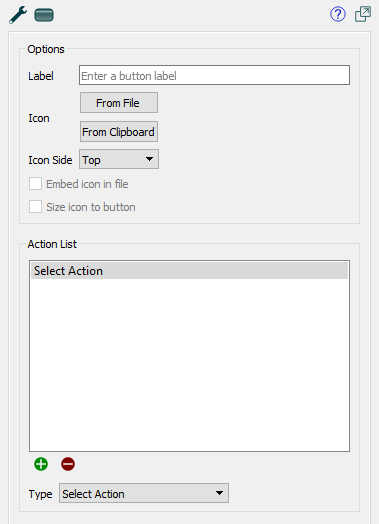
Options
Use these to set the text or picture that the button displays.
Label is the text that will be displayed on the button. If you leave this blank, the text associated with the first button action will be displayed unless you've specified an icon.
Icon specifies the picture that will appear in the button. If you don't specify any picture, the button will appear as text on a solid background with shading.
- From File will open a file selection dialog so you can choose a picture file (png, jpeg, gif, or .bmp) for the button to use.
- From Clipboard will use a picture you've placed in the clipboard.
-
 Remove (only visible when you have a picture defined already) will remove the picture and set the button back to being a text only button.
Icon Side determines on which side of the text the picture will be shown. This is only applicable if you've entered text and selected a picture for the button.
- Top will make the picture appear above the text.
- Bottom will make the picture appear below the text.
- Left will make the picture appear to the left of the text.
- Right will make the picture appear to the right of the text.
Embed icon in file, if checked, will embed the picture you've selected into the model file when it's saved, and there will be no reference to the original file. If this is not checked, you should keep the original file in the same directory as the model file or a graphics subfolder.
Size icon to button, if checked, will make the picture fit in the button. If this is not checked, the picture will be centered in the button, and either clipped or drawn on top of the button surface used for text, giving effects such as: 
Action List
Specifies the list of actions that will be taken when the button is clicked. If an action isn't viable (for example, a stop simulation action when the simulation is already stopped), the action will be skipped. If there are no viable actions in an action list, the button will be disabled, and enabled only when an action becomes enabled (when, for example, a simulation is started). An action type may have additional detail that can be specified.
- Run will run the model using the specified simulation speed. If the model is paused, it will resume the model; otherwise, it will start a new run. In presentation mode, or with a published model, if Stella Live is on, Run will stop it. If the model is already running, this command is inactive.
- Pause will pause a running model. If the model isn't running, this command is inactive.
- Resume will resume the running model (the same as Run). This command is only active when the model is paused.
- Stop will stop the current run. This command is only active when a model is running or paused. This command isn't active when Stella Live is on.
- Start Stella Live turns Stella Live on. Any changes made to inputs will cause a new simulation to occur. If the model is paused, this command will stop it.
- Stop Stella Live turns Stella Live off. This command is only active when Stella Live has been started with the Start Stella Live action.
- Simulate in Ballistic Mode will run the model to the end. If the model is paused, the simulation will continue from the paused time; otherwise, a new run will be started. Any simulation speed or pause interval set in the model will be ignored (simulation events will still cause a pause).
- Advance Time in Ballistic Mode will run the model for the amount of time specified in Time, resuming or starting a new run the same as the previous action. Any simulation speed or pause interval set in the model will be ignored (simulation events will still cause a pause). This action isn't active in Stella Live.
- Time specifies how much to advance the simulation.
- New Run will create a new run and set it to the beginning. This is active except during the time that a run is executing. If Stella Live has been started, it will be stopped.
- Restore All Devices restores both inputs and outputs as described below. Only active when both restore inputs and restore outputs are active.
- Restore All Inputs sets all variables that have been interactively controlled back to their model values (or their imported values, if you're using import sheets). This is inactive during a run, but active while paused and in Stella Live. Any continued simulation, whether new or resumed, will use the restored values. In Stella Live, this will trigger a new simulation if anything is changed.
- Restore All Outputs deletes all runs that haven't been explicitly saved, and clears graphs and tables of those results. In published models or Presentation mode, this will also stop Stella Live if it's active.
- Restore a Variable sets a specific back to the model values (or its imported value). This is inactive during a run, but active while paused and in Stella Live. Any continued simulation, whether new or resumed, will use the restored values. In Stella Live, this will trigger a new simulation if anything is changed.
- Variable specifies which variable to restore the value value for. Type in a name, and autocomplete will fill in the name (the Find window is not available on the interface).
- Import Now executes an import of the specified on demand link. The link has to be set up in the Import Data dialog box, and must be marked on demand (which means it must be have the Set parameters behavior). When the user clicks on the button the import will occur. This action is only taken on desktop software. If the model is published nothing happens when an Import Now action is taken.
- File [Sheet] Specifies which import link to execute. The filename is the one set in the import dialog.
- Export Now executes an export of the specified on demand link. The link has to be set up in the Export Data dialog box, and must be marked on demand. When the user clicks on the button the export will occur. This action is only taken on desktop software. If the model is published nothing happens when an Export Now action is taken.
- File [Sheet] Specifies which export link to execute. The filename is the one set in the export dialog.
- Set Variable sets a variable to a specific value. That value will be retained until another action or control changes it, it's reset, or inputs are restored.
- Variable specifies which variable to set a value on. Type in a value, and autocomplete will fill in the name (the Find window is not available on the interface).
- Value specifies the value you want to set the variable to.
- Reset After determines whether the value entered by the user will be reset to a specified value or simply left at the value set by the user during the remainder of the simulation.
- Never, the default, leaves the value at what the user set until the user changes it or a restore inputs command is executed.
- Every DT uses the value from the user for a single DT, then resets it to the specified value. This is useful for one time decision points where model structure is used to capture the persistence of the change.
- Every time unit uses the value until one time unit passes, then resets it. This is commonly used in models that have a pause interval of one, as it allows the user to reenter decisions or use a default.
- End of simulation resets to the specified value for the next simulation run. This allows a fresh start for each simulation run made.
Reset to value, specifies the value to reset the input to. It's only used if Reset After isn't set to Never. Typically, this is the same as the model equation, though it needn't be.
- Navigate to Page switches to a different page on the interface.
- Page lets you select which page. Choose:
- Home Page, to navigate to the page you've designated as the home page. If you later change this designation, the button will take you to your new choice.
- Previous Page to move to the previous page, as displayed in the Pages Panel(Interface). If you reorder the pages, it'll use the new sequence to navigate. If there's no previous page, nothing will happen.
- Next Page to move to the next page, as displayed in the Pages Panel(Interface). If you reorder the pages, it'll use the new sequence to navigate. If there's no next page, nothing will happen.
- Last Page Visited to move to the last page the user was on. If this is the first page the user has visited, nothing will happen.
- A specific named page to move to that page. All the pages in the interface will be displayed. Choose by name, but it will be remembered by reference even if you rename the page.
- Navigate to Story switches to a Story.
- Story lets you choose which story to navigate to.
- Page lets you specify which page. Normally, this would be the first, but you can also reenter a story at a later page.
- HTML Link lets you specify a web page to navigate to. The web page will open in a new browser window or tab, depending on the way a user has set up their browsing preferences. Note that, in the publication window, these links won't be displayed, as there's only a single window or tab allowed. You'll need to open the model in a web browser to see the behavior. In Explore or Presentation mode, clicking on a link will open it in your default web browser.