 tool.
tool. , you can also change the appearance of the button, the color of the button and the annotation box, and the text styles on the button and annotation box.
Use annotation buttons to add annotations to your Interface. You can add text, and use it to describe changes to the model, explain model behavior, or add information that doesn't make sense to add to the model itself. You can also add images or videos.
The annotation button is only available on the interface.
tool., you can also change the appearance of the button, the color of the button and the annotation box, and the text styles on the button and annotation box.
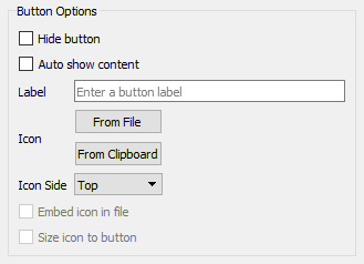
Hide button will make the button invisible on the running interface (it will appear as a shadowed box when editing). If the button is shown it will appear as any other button.
Auto show content will display the content of the annotation when a page is entered. This option is always selected if the button is hidden since there is no other way to open the annotation in this case.
Label is the label that will be displayed on the button. This is only available when Hide button is not checked.
Icon allows you to present an icon for the button. Again this is only available if Hide button is not checked.
From File lets you select a icon from a file to be displayed in the button.
From Clipboard brings the image content from the clipboard. This is only available if there is an appropriate image on the clipboard.
Embed icon in file will store the icon in the model file directly. This works well for small images, but will make the model file bigger.
Size icon to button will make the image appear in the button. If this is not selected the image will be displayed at full size centered in the button.
You can control the appearance of the button just as you would a button object. See the Button (Interface) for more details on this.
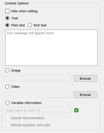
Hide when editing will hide the annotation when you are editing your interface. Once you have set the location and size of the annotation this is helpful for laying out the rest of the page content without having to navigate around the annotation, and matches the appearance of the page after the annotation has been closed when using the interface.
Text indicates that your annotation will be delivered as text.
Plan text is just what you type, with no bold, italic or font changes. You can still set the font to be used from the Style
Rich text allows you to change fonts and colors within the message and set text alignment. A simple rich text editor will be displayed if you select this option.
Image will display a picture from a file. Click on the Browse button to select a file. You can select a jpeg, gif, bmp, or png file to be displayed.
Video will show a video with simple controls to start, search, adjust volume and show full screen. The first frame of the video will be displayed when the user enters a page or opens the annotation from a button. Click on the Browser button to select a video. See Video for a discussion of video formats.
Variable information will display information about a model variable. The variable name will be shown and then you can select to documentation, equation and units.
Include documentation will show the content of the documentation tab
of the variable's property panel.
Include equation and units will show the equation (or equations for a non apply to all array) and units of measure for the variable.
Click off the panel to commit your changes. You can also set font and color information from the styles tab.