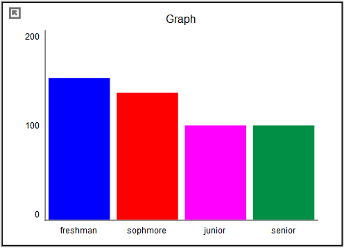
The bar graph is a variation of the graph tool that allows you to display values as different height bars. The bar graph shows values at a given time, either the simulation time, or the scrub time, as set in the Run Toolbar. As you simulate a model, the bar graph will update.
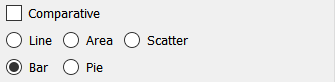
Select the graph ![]() from the Interface Build toolbar, and click on the page at the location you want it to appear (you can also add a page to an existing graph you've already put down). On the graph panel, select type bar at the top.
from the Interface Build toolbar, and click on the page at the location you want it to appear (you can also add a page to an existing graph you've already put down). On the graph panel, select type bar at the top.
Then select the variables you want to appear in the bar graph. You can include any variables you want. For more information on adding variables, see Graph Series Property Panel.
The options and styles for the bar graph are the same as those for other graphs (seeGraph Styles Tab for more discussion).
The colors for the bars will follow the color sequence set for the model (see Graph Styles Properties Panel), but you can specify the color used for each variable directly.
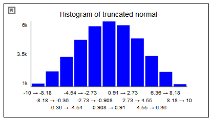
In addition to displaying the values of variables, the bar graph can be configured to display the number of times different values occur for a specific variables either across runs (as a comparative graph) or across time. The histogram is a very useful tool for understanding the range and distribution of values.
Histograms can be configured to display the raw count of values, or to normalize those so that the total over all of the bars adds up to one. The latter is very useful for looking at different numbers of runs or times without having to adjust for scale mentally. There is also an option to display a cumulative hectogram.
For example, suppose that we looked at values of a truncated normal distribution across time. The raw histogram shows the variable ranges from -10 to 10 and would reflect the full set of values (40,000 in this case).
We can ask to normalize the graph in order to display a probability density function:
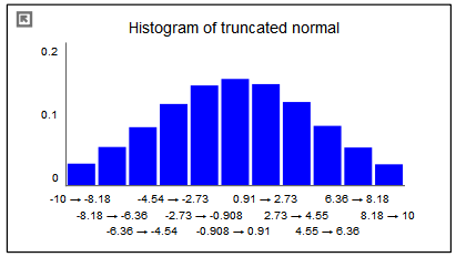
This graph is identical except for the scales. The total of all the bars will now add up to one.
By selecting the cumulate option, we can see the cumulative density function:
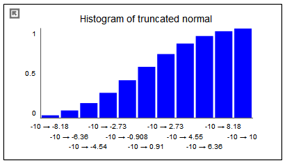
The first bar in this graph is the same as in the previous graph (though the scales are different). Each successive bar is created by adding the value of the bar from the previous graph. Thus, the final bar in the normalized cuulative histogram always has a value of 1.
The options to create and customize histograms are available from the Graph Series Property Panel.