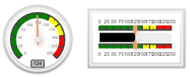
Use the gauge to display the value of a variable on either a linear indicator or a speedometer style display. The gauge changes value during a simulation, afterward reflecting the value at the end of the simulation.
Click on  in the Interface Build toolbar, and click on the page at the location you want it to appear. After placing it, you can size it by dragging its sizing handles or using the Properties panel.
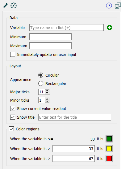
Variable names the variable that will be displayed on the gauge. You can type in a variable name, or use the  button to open the Find window to select one. If the variable you choose is an array you will need to enter the element you want to display the gauge for (e.g. shipments[1,3]).
Maximum is the maximum value for the gauge. The gauge will be all the way to the right(or top if the gauge is vertical) when the variable takes on this value. If this is blank, the maximum value entered on the Scales and Ranges Tab will be used or, if that too is missing, a values will be guessed.
Minimum is the minimum value for the gauge. The gauge will be all the way to the left (or bottom if the gauge is vertical) when the variable takes on this value. If this is blank, the minimum values entered on the Scales and Ranges Tab will be used or, if that too is missing, a values will be guessed.
Note it is best practice to enter both a minimum and maximum for every gauge.
Note if the Variable takes on a value below the minimum or above the maximum the gauge position will be that of the minimum or maximum (though a value will be displayed for vertical and, optionally, circular displays).
Immediately update on user input, if checked, will display the value that will be computed when the model is paused. If it is not checked, the gauge will display the value from the last DT (Save Interval) for flows and converters when the model is paused.
Appearance determines the way the gauge is displayed.
Circular, if checked, will display as a speedometer with a needle anchored at the bottom center going from left to right (minimum to maximum).
Rectangular, if checked, will display as a color bar moving from left to right, or bottom to top as the variable moves from minimum to maximum.
Note Rectangular gauges will go from left to right it their width exceeds their height, or bottom to top if their height exceeds their width.
Major ticks specifies the number of labeled tick marks that will appear on the gauge. Enter a value between 2 and 99. The default is 11.
Minor ticks specifies the number of tick marks that will appear between each labeled tick mark on the gauge. Enter a value between 0 and 99. The default is 11.
Show current value readout is visible only when Circular above is selected. If checked a small digital display of the variables value will appear.
Show title, if checked, will cause the entered title to be display in a location dependent on the appearance of the gauge. Enter the title you would like to appear in the edit box.
Color Regions, if checked, will display different colors for different values on the gauge scales. If this is not checked the ticks and labels will display against the background color selected for the gauge.
When the variable is <= allows you to specify the value below which the region color will be used. The default is green for this region, but you can click on the
button to select a different color.
When the variable is > allows you to specify the value above which (until the value just below this is reached) the region color will be used. The default is yellow for this region, but you can click on the
button to select a different color.
When the variable is > allows you to specify the value above which the region color will be used. The default is red for this region, but you can click on the
button to select a different color.
Note To display two colors, set the first value to match the minimum for the gauge. To display a single color, set the both values to the minimum for the gauge.
In addition to the standard size and position settings, you can specify the font to be used in the labels and the colors to draw the gauge components with.
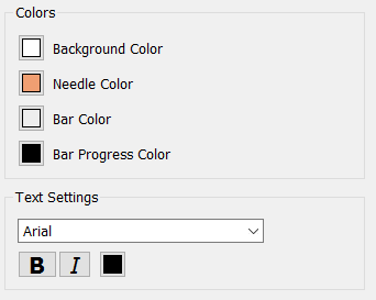
Background Color specifies the background of the gauge; all components are dawn on top of this. The default is white. Click on the color button to select a different color.
Needle Color specified the color of the needle marking the current gauge position. For circular display this is the speedometer needle that rotates clockwise as value increased. For rectangular displays this is the thin pointer used to indicate the current value. It comes in from above and below for a horizontal gauge or from right and left for a vertical gauge. The default is shown above. Click on this to select a different color.
Bar Color (rectangular only) specifies the color of the bar that will be displayed to indicate the region above or to the right of the current variable value. The default is gray, click on the color button to select another.
Bar Progress Color (rectangular only) specifies the color of the bar below or to the left of the current value. The default is black, click on the color to select another.
Choose a font face, color and attributes. All text will be drawn with this selection. There are different sizes that will be used in the drawing and these can't be customized.