The scatter graph is a variation of the graph tool that allows you to plot one variable on the x axis versus another on the y axis (instead of showing time on the x axis).
Select the graph ![]() from the Build toolbar, and click on the page at the location you want it to appear (you can also add a page to an existing graph you've already put down). On the graph panel, select type scatter at the top.
from the Build toolbar, and click on the page at the location you want it to appear (you can also add a page to an existing graph you've already put down). On the graph panel, select type scatter at the top.
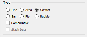
Use Comparative to display a new graph line (or set of points) for each run (only available for a single series). See Stash Data for information on the Stash Data option.
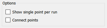
Show single point per run, if checked, will show only the value at the current time during a run or the value specified by dragging time on the Run Toolbar. This option is only available if you have selected comparative. It is valuable for showing the relationship between sensitivity parameters and the terminal values of important output variables.
Connect points, if checked, will draw line between the different points on the Scatter graph. This is an excellent way to show trajectories.
The series list for a Scatter graph keeps entries in doubles- x, y. You can have multiple series, but each series needs to have both components.
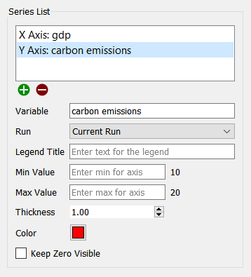
Use the ![]() button to add entries into the current series and also to add a new series. When there is an incomplete series, you can add X or Y to the series using this button. Once the series is complete, you can add a new series using this button (you will not be able to add a new series if you have selected comparative).
button to add entries into the current series and also to add a new series. When there is an incomplete series, you can add X or Y to the series using this button. Once the series is complete, you can add a new series using this button (you will not be able to add a new series if you have selected comparative).
Use the ![]() to delete the currently highlighted series. Note that this will take away both components of the series. To replace one component, click on the component and then change the variable being used in the Variable entry.
to delete the currently highlighted series. Note that this will take away both components of the series. To replace one component, click on the component and then change the variable being used in the Variable entry.
Variable is the model variable to be displayed for the currently selected component in the Series List. You can edit this using autocomplete, and also drag values in from the model or Find.
Run lets you select which run to display the results for. The default is Current Run, which will give the results for the most recently created run. If you choose a named run, the results displayed won't change as new runs are made (nor will they be erased if you restore all devices).
Legend Title is the title that will be displayed for the series, either on the right or at the bottom, depending on your choice under Graph Options below.
Min Value is the minimum value to use for the axis corresponding to the currently selected item. Leave this empty to let the software choose a value. If a run has been made, the value that the software would use is displayed to the right.
Max Value is the maximum value to use for the axis corresponding to the currently selected item. Leave this empty to let the software choose a value. If a run has been made, the value that the software would use is displayed to the right.
Note: You only need to set the min and max values on the first series. If you set them on multiple series the software will take the minimum of the minimums and the maximum of the maximums.
Note: The software will choose minimum and maximum values based on run results, unless a global minimum or maximum has been set on the Scales and Ranges Properties panel.
Keep Zero Visible, if checked, will force the scale to include 0 (at the bottom, for positive variables)
Color will determine the color of the bubbles for the selected series (click on the Z axis component to set this). The default is drawn from the color sequence specified in Graph Styles Properties Panel.
The options and styles panels for the Scatter graph are similar to other graphs and charts (seeGraph Styles Tab for more discussion).