Group Plot
Use the Group Plot to see the behavior of a selection of variables. The group plot displays a comparative graph with raw scaling for each variable so you can see what changed and when it changed, as clearly as possible.
To open the Group Plot, select click on  in the toolbar (
 ). If you have variables selected, it will open and display graphs for those variables; otherwise, you'll be asked which variables to show. If any of the current variables are arrayed, you'll be asked to select the elements to display (you can also display the min, max, mean or sum across a dimension).
The Group Plot will open:
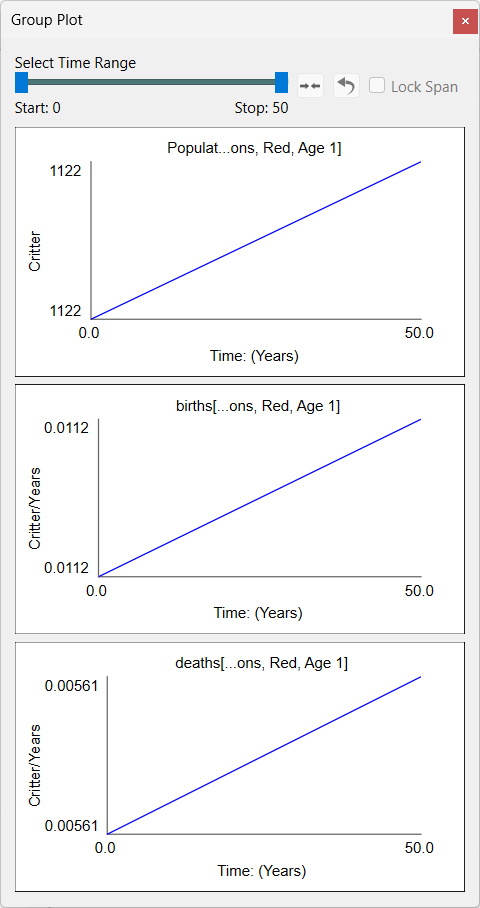
If there are a large number of variables, there will be a scroll bar to make all of them visible. You can select as many variables as you like - selecting all variables is a model will work fine for even for larger models.
If you have only 1 variable selected then you can choose to show all array elements for that variable. If you have multiple variables selected, you can only choose to show a single element of each variable (or min, max, mean, sum).
Select Time Range determines what time range is used for the determination of loop contribution and display in the graphs. It is the same control used in the Results Panel and the Causal Lens™ and they are all connected so that changes here will change what is displayed in the other places.
Seeing values at a time
You can scrub across a graph by dragging. As you do this, the values for all the graphs in that column will be displayed.
Removing Variables
To remove a variable from the group plot click on  in the upper left corner of the plot.
Adding Variables
To add one or more variables select them then right click and select Add to group plot from the Context Menu.