The pie chart is a variation of the graph tool that allows you to display values broken into different color slices of a circle, with the area of each representing the share of all values represented. The Pie Chart shows values at a given time, either the simulation time, or the scrub time, as set in the Run Toolbar. As you simulate a model, the Pie Chart will update.
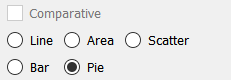
Select the graph ![]() from the Interface Build toolbar, and click on the page at the location you want it to appear (you can also add a page to an existing graph you've already put down). On the graph panel, select type Pie at the top.
from the Interface Build toolbar, and click on the page at the location you want it to appear (you can also add a page to an existing graph you've already put down). On the graph panel, select type Pie at the top.
Then select the variables you want to appear in the pie chart. You can include any variables you want. For more information on adding variables, see Graph Properties Panel
The options and styles for the pie chart are the same as those for other graphs (see Styles Tab for more discussion).
The colors for the pie slices will follow the color sequence set for the model (see Graph Styles Properties Panel), but you can specify the color used for each variable directly.
The pie chart has an additional option to label the pie slices.
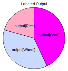
These labels are drawn in addition to the legend labels. How good these will look will depend upon the relative size of the slices and the colors chosen.