Use the Graph Properties Panel to view and edit the properties of graphs.
To view the graph's Properties Panel, click on the graph in Edit ![]() mode. In Explore or Experiment mode, double-click the graph.
mode. In Explore or Experiment mode, double-click the graph.
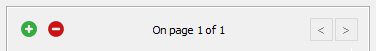
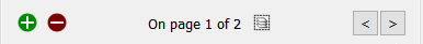
Graphs are displayed in containers that can have a number of pages. The properties panel will open on the currently visible page, and you can navigate to other pages using the < and > buttons on the panel. Use the ![]() button to add a new graph page after the current page, and the
button to add a new graph page after the current page, and the ![]() button to remove the currently visible page. You can create as many pages you want. As you add or navigate, both the page you're on and the total number of pages will be displayed. Once you add more than one page to a graph you will also see an icon (
button to remove the currently visible page. You can create as many pages you want. As you add or navigate, both the page you're on and the total number of pages will be displayed. Once you add more than one page to a graph you will also see an icon (![]() )to edit multiple pages:
)to edit multiple pages:
Editing multiple pages will display a subset of the graph properties for all pages in the graph container. Any changes you make will be applied to all of the contained graphs.
See Pages Styles for more discussion of the pages.
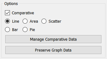
Select the type of graph you want to create. For line and scatter, you can choose to generate a standard or a comparative graph (by selecting the Comparative check box). Comparative graphs show multiple simulation runs on a single graph.
Scatter – Select this option to chart the values of one variable versus another, as these values change over time. When you select this option, you can select only two variables (one for the x axis and one for the y axis).
Tip: To have the plotted points connected in the generated graph, select the Connect Points check box under Graph Options, below.
Select this check box to generate the selected graph type in comparative mode (not available for Area, Bar, or Pie). The checkbox is also grayed if you've already added more than one variable to the series list.
This option is often used in conjunction with sensitivity analysis. When comparative graphs are generated and sensitivity analysis is turned on, clicking the ![]() button at the top of the graph displays a journal of the most recent sensitivity setup used to create the graph.
button at the top of the graph displays a journal of the most recent sensitivity setup used to create the graph.
Tip: Comparative graphs show results from all saved runs. You can set the number of runs to be saved, as well as whether comparatives should accumulate all runs, in the Data Manager. Alternatively, you can clear the data from all graphs and tables at once by choosing Restore>All Devices from the Model menu.
Manage Comparative Data will open the Data Manager, allowing you to remove or reorder runs. This button is only active when Comparative is checked.
Preserve Graph Data will preserve the data currently displayed in the graph by specifying specific variable and run combinations. After clicking on this, the graph will no longer change when you make new runs and will not be emptied when you restore outputs. To clear a graph that you've preserved this way, you'll need to click on Release Graph Data.
Release Graph Data becomes available if you click on Preserve Graph Data, above. If the graph was previously comparative (and there is more than one run preserved), the graph will again be marked comparative.
Note: Releasing graph data can't be completely undone. If you're releasing data from runs that are marked locked in the data manager, those runs will be permanently deleted.
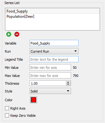
This list lets you select the variables to be displayed in the graph, and the way in which they're displayed. Not all of the choices are available for all of the graph types. A variable, along with the associated information for displaying it, is called a series. Use the ![]() button to add a new series or the
button to add a new series or the ![]() button to remove the selected series from the graph (this doesn't change the model itself, only the graph). Scatter graphs have 2 series, but these buttons are not available.
button to remove the selected series from the graph (this doesn't change the model itself, only the graph). Scatter graphs have 2 series, but these buttons are not available.
Variable is the model variable to plot. You can type in a value (you'll be prompted for a name), drag a value from the Find window, or Ctrl-drag (⌘-drag on Mac) a variable from the model diagram.
Note: You can also add variables to a graph by dragging them onto the graph, directly on the model itself.
Run lets you select which run to display the results for. The default is Current Run, which will give the results for the most recently created run. If you choose a named run, the results displayed won't change as new runs are made (nor will they be erased if you restore all devices).
Legend Title is the title that will be displayed for the series, either on the right or at the bottom, depending on your choice under Graph Options below.
Min Value is the minimum value to use for the Y axis. Leave this empty to let the software choose a value. If a run has been made, the value that the software would use is displayed to the right.
Max Value is the maximum value to use for the Y axis. Leave this empty to let the software choose a value. If a run has been made, the value that the software would use is displayed to the right.
Note: The software will choose minimum and maximum values based on run results, unless a global minimum or maximum has been set on the Scales and Ranges Properties panel.
Line Appearance
To set line appearance on comparative graphs, use the Graph Styles Properties Panel for the model. These are the same for all comparative graphs. Not all options are available for all graph types.
Thickness is the line thickness, in points, to be plotted. Choose a value, starting at 0.5. You can either type in a number, or use the dial to raise or lower the value.
Style is the line style to be used in drawing the curve(s). Choose between Solid, Dash-Dot, Dashed, and Dotted.
Color is the color to be used when displaying the series. Click on the square to change the color.
Right Axis, if checked, causes the scale for the selected series to be displayed on the right axis. If it's not checked, the scale will be displayed on the left axis.
Keep Zero Visible, if checked, will force the scale to include 0 (at the bottom, for positive variables).
Override Thickness, if checked, will set the line thickness for each graph line to the value you specify. This is only available for comparative graphs.
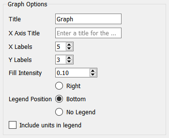
This lets you select the options for displaying the graph.
Title is the title that will be displayed at the top of the graph.
X Axis Title is the title that will be displayed at the bottom of the graph.
X Labels determines the number of labels that will be displayed along the X axis. Use 0 to hide the labels, or a number 2 or greater.
Y labels determines the number of labels that will be displayed along the Y axis. Use 0 to hide the labels, or a number 2 or greater.
Fill Intensity (area graphs only) determines how opaquely the area between the graph lines is filled in. Use 0 to have only the graph lines show, or 1 to have the graph lines and the fill between the lines the same color. Generally a small value such a 0.1 will work best.
Legend determines where the legend for the series identifiers will appear. Select Right, Bottom, or No Legend (to hide the legend).
Show numbers on series, if selected, will display the number 1 on the first series, 2 on the second, and so on. This can be helpful in distinguishing series when colors and line styles are not sufficiently distinct.
Include units in legend, if checked, will include the units of measurement for the variable in the legend. This option isn't available for comparative graphs, as the legend entries in that case will be run names and not variable names.
Note: The left and right axis titles under Connect Dots below are a very helpful place to put units.
Scatter Charts
There are two additional options that appear only for Scatter charts.
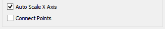
Auto Scale X Axis, if selected, will round values on the X axis to make them more readable.
Connect Points, if selected, will draw lines between the points in the scatter plot. This can be useful in making phase plots.
Pie Chart
There is an additional option available only for pie charts.

Label pie slices, if selected, will put labels directly onto the pie chart. This can make it easier to read the pie chart when there are a relatively small number of things being shown.
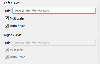
Use these entries to control the appearance of the Left and (optionally) Right axes. The right axis options are available only if you've included a series with Right Axis checked, under Series List above.
Title is the title that will be displayed next to the axis, with vertical text. If this is left blank, no title will be displayed.
Multiscale, if checked, will cause each series to be displayed with a separate scale. If this isn't checked, all series will be displayed on the same scale (though the left and right axes will always be on different scales).
Auto Scale, if checked, will cause the software to expand the scales used to round numbers, in order to make the values easier to read.
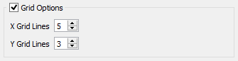
If this option isn't checked, graphs will be displayed with a left and bottom axis only. They will be open on the top and right. If checked, you can specify the number of grid lines.
X Grid Lines specifies how many lines, including the left and right, to display. Setting this the same as X Labels in Graph Options above will create a grid line for each label.
Y Grid Lines specifies how many lines, including the top and bottom, to display. Setting this the same as Y Labels in Graph Options above will create a grid line for each label.
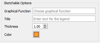
Sketchable options allow you to add a graphical function to the graph and have users sketch the shape of the function on the graph. See Sketchables for more information.
Graphical Function names the variable to sketch. This variable must be a Graphical Function and must have Time as its equation.
Title is the title that will appear in the legend. If left blank, the name of the graphical function will be used.
Thickness is the line thickness of the sketchable curve.
Color is the color of the sketchable curve.