Use the Graph settings Properties Panel to view and edit the layout and appearance of graphs including the Area Graph, Pie Chart and Bar Graph. The setup for graphs is broken into three parts. This panel let you control labeling and layout, the Graph Series Property Panel lets you set up the basic type of graph and the series that will be displayed,and the Graph Styles Tab of the Properties Panel lets you set fonts and colors.
To view the graph's Properties Panel, click on the graph in Edit ![]() mode. In Explore or Experiment mode, double-click the graph. If it is not already selected click on the
mode. In Explore or Experiment mode, double-click the graph. If it is not already selected click on the ![]() tab.
tab.
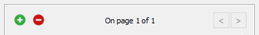
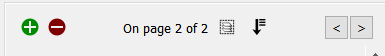
Graphs are displayed in containers that can have a number of pages. The properties panel will open on the currently visible page, and you can navigate to other pages using the < and > buttons on the panel. Use the ![]() button to add a new graph page after the current page, and the
button to add a new graph page after the current page, and the ![]() button to remove the currently visible page. You can create as many pages you want. As you add or navigate, both the page you're on and the total number of pages will be displayed. Once you add more than one page to a graph you will also see an icon (
button to remove the currently visible page. You can create as many pages you want. As you add or navigate, both the page you're on and the total number of pages will be displayed. Once you add more than one page to a graph you will also see an icon (![]() )to edit multiple pages:
)to edit multiple pages:
Editing multiple pages will display a subset of the graph properties for all pages in the graph container. Any changes you make will be applied to all of the contained graphs.
You can reorder pages by clicking on ![]() and rearranging the sequence in the Reorder Pages
and rearranging the sequence in the Reorder Pages
See Pages Styles (Interface)for more discussion of the pages.
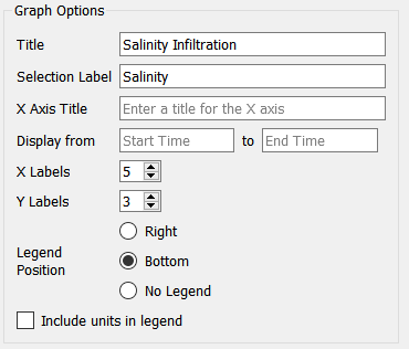
This lets you select the options for displaying the graph.
Title is the title that will be displayed at the top of the graph.
Selection Label is the label that will be used when tabs or a dropdown is used to select different graphs. This is available only on the interface.
X Axis Title is the title that will be displayed at the bottom of the graph.
X Labels determines the number of labels that will be displayed along the X axis. Use 0 to hide the labels, or a number 2 or greater.
Y labels determines the number of labels that will be displayed along the Y axis. Use 0 to hide the labels, or a number 2 or greater.
Fill Intensity (area graphs only) determines how opaquely the area between the graph lines is filled in. Use 0 to have only the graph lines show, or 1 to have the graph lines and the fill between the lines the same color. Generally a small value such a 0.1 will work best.
Legend determines where the legend for the series identifiers will appear. Select Right, Bottom, or No Legend (to hide the legend).
Show numbers on series, if selected, will display the number 1 on the first series, 2 on the second, and so on. This can be helpful in distinguishing series when colors and line styles are not sufficiently distinct.
Include units in legend, if checked, will include the units of measurement for the variable in the legend. This option isn't available for comparative graphs, as the legend entries in that case will be run names and not variable names.
Note: The left and right axis titles under Connect Dots below are a very helpful place to put units.
Scatter Charts
There are two additional options that appear only for Scatter charts.
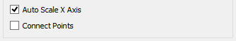
Auto Scale X Axis, if selected, will round values on the X axis to make them more readable.
Connect Points, if selected, will draw lines between the points in the scatter plot. This can be useful in making phase plots.
Pie Chart
There is an additional option available only for pie charts.

Label pie slices, if selected, will put labels directly onto the pie chart. This can make it easier to read the pie chart when there are a relatively small number of things being shown.
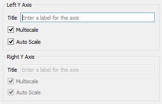
Use these entries to control the appearance of the Left and (optionally) Right axes. The right axis options are available only if you've included a series with Right Axis checked, under Series List above.
Title is the title that will be displayed next to the axis, with vertical text. If this is left blank, no title will be displayed.
Multiscale, if checked, will cause each series to be displayed with a separate scale. If this isn't checked, all series will be displayed on the same scale (though the left and right axes will always be on different scales).
Auto Scale, if checked, will cause the software to expand the scales used to round numbers, in order to make the values easier to read.
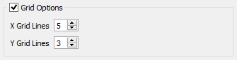
If this option isn't checked, graphs will be displayed with a left and bottom axis only. They will be open on the top and right. If checked, you can specify the number of grid lines.
X Grid Lines specifies how many lines, including the left and right, to display. Setting this the same as X Labels in Graph Options above will create a grid line for each label.
Y Grid Lines specifies how many lines, including the top and bottom, to display. Setting this the same as Y Labels in Graph Options above will create a grid line for each label.
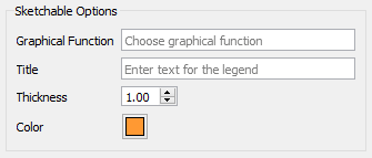
Sketchable options allow you to add a graphical function to the graph and have users sketch the shape of the function on the graph. See Sketchables for more information.
Graphical Function names the variable to sketch. This variable must be a Graphical Function and must have Time as its equation.
Title is the title that will appear in the legend. If left blank, the name of the graphical function will be used.
Thickness is the line thickness of the sketchable curve.
Color is the color of the sketchable curve.