When you publish an interface to the web, it can be viewed by anyone with a web browser. This includes people using computers, tablets, and phones. Having an interface that will resize will allow you to let people with all these devices use your interface without having to scroll or deal with overcrowded display areas.
The default resizing mode is proportional rescaling, which will work well for most interfaces.
Open the Interface Settings Properties Panel by clicking on an empty portion of your interface. In this panel, click on the Resizable Options button. This will open the Resizable Options dialog where you can set your preferences (including preventing any resizing).
A fixed size interface will not adjust based on the browser window size, instead it will present scroll bars if it can't be fully displayed, or leave empty space around it (filled in by the browser) if the browser window is bigger.
To make an interface fixed in size uncheck both of the resizing options on the Resizable Options dialog and then uncheck the resize option for each page that has it checked:
You can have some pages resize, while others do not, in this manner (though doing this is not recommended as it can confuse users).
The default resizing option is to scale all of the window content to fit the window that the interface is presented in. The will work very well on a wide variety of devices. It is only when the window becomes too small relative to the content (either because you have chosen a very large interface page size, or because the browser windows has become very small) that some elements may be hard to read or use.
To enable proportional resizing simply check the Zoom content to fit space option on the Resizable Options dialog.
In anchor based resizing, objects are repositioned and resized based on any anchors you have set for them. Font sizes, however, remain fixed. This simple approach to managing sizes on different devices works reasonably well for as long as the adjustments are not too big, but it can lead to buttons and other objects that are overly crowded or seem out of place.
If you do not set any anchors specifically, every object on the page will be repositioned and resized as the overall page size changes. The location and size of all objects is effectively a percentage of the page size. But again font size does not change.
Rather than letting all of the objects float, as they do by default, you can anchor them to different quadrants of the page - top, bottom, left, and right. When an object is anchored, it maintains its position (in pixels) relative to the side it's anchored against. When you anchor an object to one side, it will also stop changing size in that dimension. For example, if you anchor it to the bottom, then the height of the object will not change, but the width will. If you anchor it to the left and the bottom, neither the width nor the height will change. If you anchor it to opposite sides, for example, the top and bottom, the size will change in order to keep the distance to the edge of the screen constant.
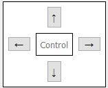
To set the anchors, open the Styles Tab, and click on the anchors to toggle them on or off:
You'll need to experiment with your object settings to achieve the desired effects.
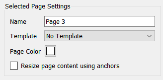
To enable anchor based resizing uncheck the Zoom content to fit space option on the Resizable Options dialog. Then, on the Interface Settings Properties Panel check the Resize page content using anchors checkbox for each page you want to resize (if this button is not checked the page will not resize, instead scroll bars will appear).
Open Windowed Presentation mode  from the build toolbar. As you resize the window the interface layout will adjust. The effects should be the same as you will see after publication. You can also test the published site by resizing the browser window you are displaying you interface in.
Remember, most people will not resize their browser window. The initial size of their browser window will determine the layout of the page. Thus the adjustment from one size to another is not as important as the way it looks for different sizes.
Note Changing the page size will not move any of the objects you have laid out. The objects are placed on a page of the size you set, then adjusted after publication. Thus picking a page size that is similar to what you expect users to have is still very useful.