Use the Styles tab to format a selected object or objects. What shows up in the Styles tab depends on what you've selected. Each different type of object has different things that can be styles, and when multiple objects are selected, only the style elements common to them will be shown.
In addition to the common elements on the style tab shown here, there are also entries for the model (Model Style Properties Panel) building blocks (Styles Tab for Building Blocks), graphs (Graph Styles Tab), tables (Table Styles Tab), and group inputs (Group Input (Interface))
The Styles tab works the same on the model and interface, but the interface has a wider variety of things that can be styled.
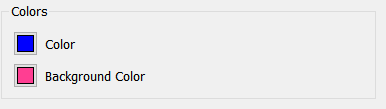
Use the colors section to set the text and background (or fill) colors for the selected item. For certain items, borders and lines can also be set.
For either choice, a Select Color window will appear as shown.
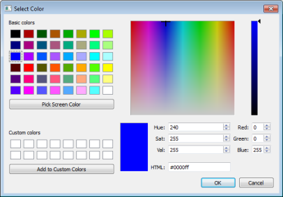
Click a preset color or change the numeric values to edit the color.
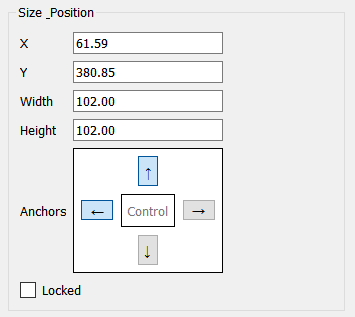
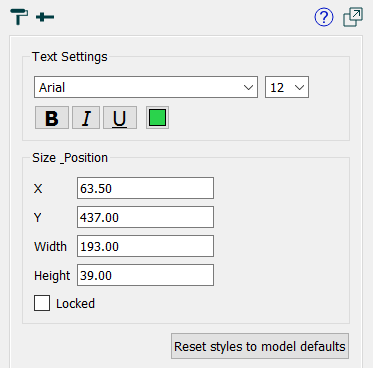
Hint: Specifying the size and position of objects is a precise alternative to lining them up by dragging them. For example, if you have a number of sliders you want to line up vertically, you can select them all, then specify x and width while leaving y and height blank, and they'll all be the same width and start at the same x coordinate.
Locked Notes
If you want to edit the properties for a locked object, you'll need to double-click on the object.
Using Select All from the Edit menu will select locked objects. This means that you can copy the entire contents of a page and paste them into another page. After pasting, the object will remain locked.
These apply only to text boxes, numeric displays, buttons, and annotation buttons that don't have their button hidden.
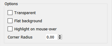
Transparent, if checked, will make the background transparent. You can use this to allow overlapping placement of different objects (for example, placing text on top of a graphic). Transparent buttons have some uses, though it's generally preferable to use an icon in the button as this will both display and highlight correctly when activated.
Flat background (for buttons and annotation buttons only), if checked, changes the appearance of the button by taking away the shading.
Highlight on mouse-over (for buttons and annotation buttons only), if checked, causes the button to change appearance as the mouse cursor passes over it.
Corner Radius (buttons and annotation buttons only) determines how much rounding will be put on the corners of the button. Use 0 for a rectangular button, and a larger value to round the corners. When the value exceeds 1/2, the smaller of the width and height of the button increasing it will have no further impact on shape.
Note: Different browsers have different conventions for the display of buttons, so even when the corner radius is 0, the buttons may show some rounding.
Different objects may have additional colors. Select them using the color selection process described above.
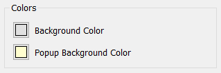
Background Color determines the background color that will be used to draw text. This isn't applicable if Transparent was checked (or for an annotation button with the button marked hidden).
Popup Background Color applies to annotation buttons only. It determines the background color that's displayed around the text of the annotation.
You can set border styles on a Button (Interface), the button associated with an Annotation Button (Interface), Text boxes, Loop Labels, Graphics box, Video, and Shape (interface).
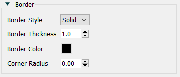
Border Style is one of Solid or None. If you select None, the thickness and color selections will have no effect.
Border Thickness is the thickness of the border in pixels. This has an effect only if the border style is solid.
Border Color is the color of the border. Click on the color button ( ) to select a color.
Corner Radius determines the rounding of the shape. Use 0 to create a square shape. Use a larger number to make the shape more rounded. Note that a large corner radius may change the amount of text that is visible and require adjustment of margins.
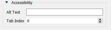
Use the accessibility to set the highlighting sequence that will be used for the tab key and to specify alternative text for the object that can be read by a screen reader and also will be displayed on hover. See Interface Accessibility for more discussion. These options are visible only if you have selected the option to make the interface screen reader friendly in the Publishing Options dialog
Alt Text is the alternative text that will be associated with the object you are setting styles for. Most browsers will display this when the use hovers the mouse over the object and will also provide it to a screen reader.
Tab Index determines the tab order when moving between the objects using the Tab key. Note that most browsers have additional elements to focus on (such as the URL for the page) so that using the Tab key will leave and then reenter the interface page.
Reset styles to model defaults will change the style to use the model default style. This means that if you change the model default, that change will cascade to the currently selected objects. For example, if you change the font size and color on the model properties panel, it will change the font size and color for the selected objects. Not all elements of styles can be accessed as the model default, and clicking on this may do nothing to those elements of the styles.