Use the Graph Series Property Panel to view and edit the properties of graphs including the Area Graph, Pie Chart and Bar Graph, and Pyramid Graph. The setup for graphs is broken into three parts. This panel lets you set up the basic type of graph and the series that will be displayed, Graph Settings Properties Panel lets you control labeling and layout, and theGraph Styles Tab of the Properties Panel lets you set fonts and colors.
To view the graph's Properties Panel, click on the graph in Edit ![]() mode. In Explore or Experiment mode, double-click the graph. If it is not already selected click, on the
mode. In Explore or Experiment mode, double-click the graph. If it is not already selected click, on the ![]() tab.
tab.
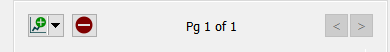
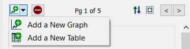
Graphs are displayed in containers that can have a number of pages consisting of graphs and tables. The properties panel will open on the currently visible page, and you can navigate to other pages using the < and > buttons on the panel. Use the ![]() button to add a new graph page after the current page, and the
button to add a new graph page after the current page, and the ![]() button to remove the currently visible page. You can add a table by clicking on the
button to remove the currently visible page. You can add a table by clicking on the ![]() in the dropdown and selecting Add a New Table (this will open the Table Properties
in the dropdown and selecting Add a New Table (this will open the Table Properties
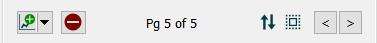
You can create as many pages you want. As you add or navigate, both the page you're on and the total number of pages will be displayed. Once you add more than one page to a graph you will also see a button ![]() that allows you to edit multiple pages:
that allows you to edit multiple pages:
Editing multiple pages will display a subset of the graph properties for all pages in the graph. Any changes you make will be applied to all of the contained graphs. Containers with both graphs and tables will not have any properties in common to change.
You can reorder pages by clicking on ![]() and rearranging the sequence in the Reorder Pages
and rearranging the sequence in the Reorder Pages
See Pages Styles (Interface)for more discussion of the pages.
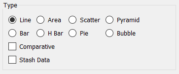
Select the type of graph you want to create. Each of the types has options associated with it to change its appearance and behavior.
Tip: To create a confidence graph select the Plot confidence values check box under Graph Options, below.
Scatter – Select this option to chart the values of one variable versus another, as these values change over time, or at a point in time. When you select this option, you can select only two variables (one for the x axis and one for the y axis). See Scatter Graph for more discussion.
Tip: To have the plotted points connected in the generated graph, select the Connect Points check box under Scatter Options, below.
Tip: To create a Correlation plot of an input and output across runs, select the Correlation Plot check box under Scatter Options below.
Comparative, if checked, shows multiple simulation runs on a single graph. This option is often used in conjunction with sensitivity analysis. When comparative graphs are generated and sensitivity analysis is turned on, clicking the ![]() button at the top of the graph displays a journal of the most recent sensitivity setup used to create the graph. See Sensitivity Parameters dialog (Model Only) for more information.
button at the top of the graph displays a journal of the most recent sensitivity setup used to create the graph. See Sensitivity Parameters dialog (Model Only) for more information.
Comparative is only available for Line, Scatter, Bar, and Bubble graphs (and will be grayed if you have added 2 or more series. Some of these graph types also have a more specialized format that can be used to present many runs (typically from a Sensitivity Analysis) compactly:
Confidence graphs (model Only) show the spread of values associated with different percentiles across multiple runs. This option is available for graph type Line when Comparative is checked.
Correlation plots (model only) show the relationship of one variable to another at a point in time across several runs. Correlation plots are created by checking the box to show a single point per run on a Scatter chart when Comparative is checked.
Histograms (model only) show the distribution of values across multiple runs, or across time for a single run. This option is available for graph type Bar.
Tip: Comparative graphs show results from all saved runs. You can set the number of runs to be saved, as well as whether comparatives should accumulate all runs, in the Data Manager. You can clear the data from all graphs and tables at once by choosing Restore>All Devices from the Model menu.
Stash Data, if checked, will provide a stash button on the graph to remember any variables displayed for the current run. See Stash Data for information on this option.
Each of the different graph types has specific options relating only to that graph type.
Options on the line graph vary depending on whether comparative is selected. If it is not selected only Show numbers on series is available. Confidence graphs are not available on the interface.
Note Show numbers on series is available in the model window and on the interface. The remaining options apply only for graphs created in the model window.
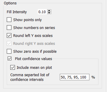
Fill Intensity is available when both Comparative and Plot confidence values are checked. It determines the intensity of shading inside the regions of the confidence graphs and varies from 0 (no shading) to 1.0 (solid color the same as the dividing lines). Generally a small, but positive, number will work best here.
Show points only, if checked, will draw each value as a point, without connecting the points. This is useful when the time axis may be different for the different variables shown.
Show numbers on series, if checked, will place numbers along the graph lines (1 for the first, 2 for the second and so on). These can be useful to help distinguish the graph lines, especially when the graphs are being presented in black and white.
Round left/right Y axis scales, if checked, will round the values in the associated Y axis so that the scales are easier to read. If not checked no adjustment will be made.
Note This option does not affect any variable for which an individual minimum or maximum has been specified in either the graph definition or the scales and ranges panel for the variable itself.
Show 0 axis if possible, if checked, will display a horizontal gridline at 0. This option only matters when the minimum on the graph is negative and the maximum positive, otherwise the gridline would be displayed anyway.
Include mean on plot, if checked, will show the mean value across all runs as a line on the graph. This is distinct from the median (the 0th percentile) and can be helpful in highlighting asymmetries in the distribution of outcomes.
Comma separated list of confidence intervals lets you specify how the graph values are split up. You can enter as many numbers as you want, though typically 3 to 5 will work best. That range (minimum and maximum) of values that the specified percent of runs fall into at each time will be displayed. Use 0 for the median, and 100 for the full bounds.
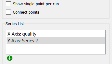
The Scatter Plot allows you to specify an X and Y axis. When you select this option, the Series List identifies the X and Y axis. You can use the ![]() or click on the series and enter the name in the Variable field. The first will be used as the X (independent) variable and the second as the Y (dependent) variable. The two do not need to have any direct causal link, but generally the expectation is that changes in X will lead to changes in Y.
or click on the series and enter the name in the Variable field. The first will be used as the X (independent) variable and the second as the Y (dependent) variable. The two do not need to have any direct causal link, but generally the expectation is that changes in X will lead to changes in Y.
Show single point per run, if checked, will only show a single time point instead of values over all time points. This option is only available for comparatives, where it can be used to show the relationship between assumptions and outcomes (the graph is also called a correlation plot). In this case the X axis is typically one of the parameters varied for sensitivity.
Connect points, if checked, will connect points sequentially. This is a useful option when the X and Y values represent locations, as the connected plot can then be used to show a trajectory.
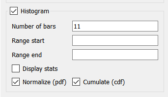
Histogram/Histogram over time, if checked, will present the Bar graph by grouping the values in each simulation and then displaying the number of occurrences in each group. This option is available only on the model window. If comparative has been selected the label will be Histogram, if not the label will be Histogram over time. If checked, the below options will also be enabled.
Number of bars specifies the number of bars that will be displayed. In general, the larger the number of simulations (or times) there are, the larger the number of bars that can be meaningfully displayed.
Range start, if specified, indicates the smallest value that will be considered in counting values for bars. Any results below this number will be ignored. You can use this, combined with Range end and the number of bars, to control the way values are grouped. For example, running from 0 to 100 with 5 bars will group values in increments of 20 [0-20), [20-40) and so on. Leave this blank to let the software choose groups that will ensure that values will not be excluded because they are too small.
Range end, if specified, indicates the largest value that will be considered in counting values for bars. Any results above this number will be ignored. Leave this blank to let the software choose groups that will ensure that values will not be excluded because they are too large.
Display stats, if checked, will display statistics related to the information presented in the bars.
Mean is the algebraic average of the values.
Min is the minimum of all values.
Median is the value for which half of the values are above, and half below.
Max is the maximum of all values.
Std. Dev. is the standard deviation of the counted values.
25% Percentile is the value that is larger than 25% of all values (and smaller than 75%).
75% Percentile is the value that is larger than 75% of all values (and smaller than 25%).
Interquartile Range is the different in value between the 75th and 25th percentile.
Normalize (pdf), if checked, fill normalize the count so that it shows relative frequency rather than the number of occurrences. This allows you to create probability density functions that are independent of the number or runs (or times) used to create the histogram.
Cumulate (cdf) if checked, presents the normalized histogram by adding the value of the previous bar when displaying the current bar. This will create a cumulative density function with the last bar, by construction, having a value of 1.
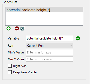
This list lets you select the variables to be displayed in the graph, and the way in which they're displayed. Not all of the choices are available for all of the graph types. A variable, along with the associated information for displaying it, is called a series. Use the ![]() button to add a new series or the
button to add a new series or the ![]() button to remove the selected series from the graph (this doesn't change the model itself, only the graph). If you have selected a series with a * in it, the
button to remove the selected series from the graph (this doesn't change the model itself, only the graph). If you have selected a series with a * in it, the ![]() button will appear. This will expand the * showing each of the individual elements (e.g. sales[North], sales[South] from sales[*]). For Scatter and Bubble graphs, the
button will appear. This will expand the * showing each of the individual elements (e.g. sales[North], sales[South] from sales[*]). For Scatter and Bubble graphs, the ![]() button will delete pairs or triplets of series and the
button will delete pairs or triplets of series and the ![]() button will add to the incomplete elements of the series pair or triplet.
button will add to the incomplete elements of the series pair or triplet.
have 2 series, but these buttons are not available.
Variable is the model variable to plot. You can type in a value (you'll be prompted for a name), drag a value from the Find window, or Ctrl-drag (⌘-drag on Mac) a variable from the model diagram.
Note If you select a * for the variable name it will leave the * in the name in the list, and only expand it when displaying the graph. This way, change array elements will automatically update the graph. To set colors and other things on individual elements use the
button to expand the list.
Note You can also add variables to a graph by dragging them onto the graph, directly on the model itself.
Run lets you select which run to display the results for. The default is Current Run, which will give the results for the most recently created run. If you choose a named run, the results displayed won't change as new runs are made (nor will they be erased if you restore all devices).
Legend Title is the title that will be displayed for the series, either on the right or at the bottom, depending on your choice under Graph Options below.
Min Value is the minimum value to use for the Y axis. Leave this empty to let the software choose a value. If a run has been made, the value that the software would use is displayed to the right.
Max Value is the maximum value to use for the Y axis. Leave this empty to let the software choose a value. If a run has been made, the value that the software would use is displayed to the right.
Note: The software will choose minimum and maximum values based on run results, unless a global minimum or maximum has been set on the Scales and Ranges Properties panel.
Line Appearance
To set line appearance on comparative graphs, use the Graph Styles Properties Panel for the model. These are the same for all comparative graphs. Not all options are available for all graph types.
Thickness is the line thickness, in points, to be plotted. Choose a value, starting at 0.5. You can either type in a number, or use the dial to raise or lower the value.
Style is the line style to be used in drawing the curve(s). Choose between Solid, Dash-Dot, Dashed, and Dotted.
Color is the color to be used when displaying the series. Click on the square to change the color.
Right Axis, if checked, causes the scale for the selected series to be displayed on the right axis. If it's not checked, the scale will be displayed on the left axis.
Keep Zero Visible, if checked, will force the scale to include 0 (at the bottom, for positive variables).
Override Thickness, if checked, will set the line thickness for each graph line to the value you specify. This is only available for comparative graphs.
Choose a variable in one of the following ways:
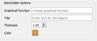
Sketchable options allow you to add a graphical function to the graph and have users sketch the shape of the function on the graph. See Sketchables for more information.
Graphical Function names the variable to sketch. This variable must be a Graphical Function and must have Time as its equation.
Title is the title that will appear in the legend. If left blank, the name of the graphical function will be used.
Thickness is the line thickness of the sketchable curve.
Color is the color of the sketchable curve.